NC Graphic Design work 2006-07

This is a photograph I took of the room the NC Graphic Design course took place.
The following items were made during my one year graphic design course at Glasgow Metropolitan College. These were made at a time when my skills with Photoshop and other software packages were in their infancy. (It was during the multimedia course I did next that I learned to use these tools like a pro.) Also, at the time, the only digital camera I had didn't have image stabilisation, so most of photos I took for these works are blurry (which can be observed in the photo above).
So, why am I posting this work here, you ask? Well, ... its because its worth looking back to see how your style came about.
The first things worth showing is what was the only thing awarded a "client's choice" sticker (featuring a black-and-white photo of George W Bush giving a thumbs up) from the lecturers. They were given to three best works form each assignment. It's mostly a motivational gesture than a very serious mark on your grade.
The first things worth showing is what was the only thing awarded a "client's choice" sticker (featuring a black-and-white photo of George W Bush giving a thumbs up) from the lecturers. They were given to three best works form each assignment. It's mostly a motivational gesture than a very serious mark on your grade.


It was during my time on this course that I truly discovered my fascination with advertising. I enjoyed seeing commercials on TV and billboards on my way to and from school as a kid. It was only during this course I thought about the subject seriously. The college library had volumes full of old ads (mostly annual compilations by advertising bodies), which I looked through during my lunch breaks. It never occurred to me that I could get a career creating ads. Your never told that is a job when you were a kid or in high school by your career's adviser.


These two posters were made for a competition held in the college.
The one on the left was the my entry. It made it to the final three for consideration.
The one on the right was one I made just to show what kind of ideas I could have.
We were given a brief and one day to make it. .


The photo on the right is my first (and so far only) attempt at packaging design


An experiment in typography.
Moving on...

A project about science. A subject right up my alley.
The jet engine poster above was a joy to make, as I made similar things before.


An attempt at magazine design.


The magazine contents page on the left was asked by the lecturers to be a monochrome design.
The ad on the right was for a fictional business we made corporate identity for.


A book about the Victorian House.
(The author's photo is of a fellow student I asked to pose for the photo.)


Poet Eileen Auld commission our class to design her book of poems.
Each of us were given the task of designing the pages of two of her poems and the cover.
My two pages below ended up in the final book.


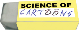
A end of year personal project - I decided on making stuff for a fictional exhibition at Glasgow Science Centre about the "Science of Cartoons."


And finally, an attempt at a personal business website.
(This was made by applying graphics to a screenshot of a browser.)


They were more things I made back then, but sadly, I don't have any record of them on me.They may only exist as physical prints in the portfolio I had at the time (and gave to my lecturers to mark when the course ended).
Looking back, you can see elements of future works in these. But you can also see why I only gained one "client's choice" sticker throughout that course. I relied too much on my drawing because back then I didn't have that much experience with Adobe software or digital photography (the only camera I had had no image stabilisation, remember).
Of course that was a long time ago....

